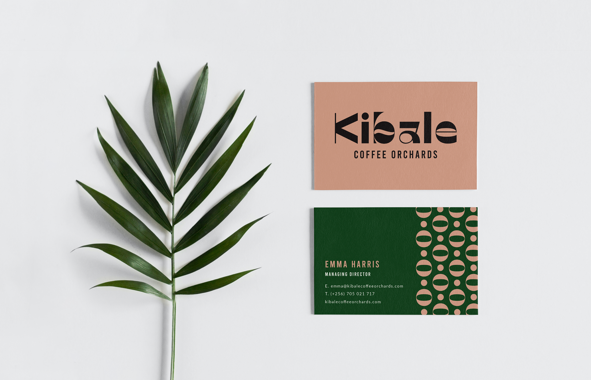
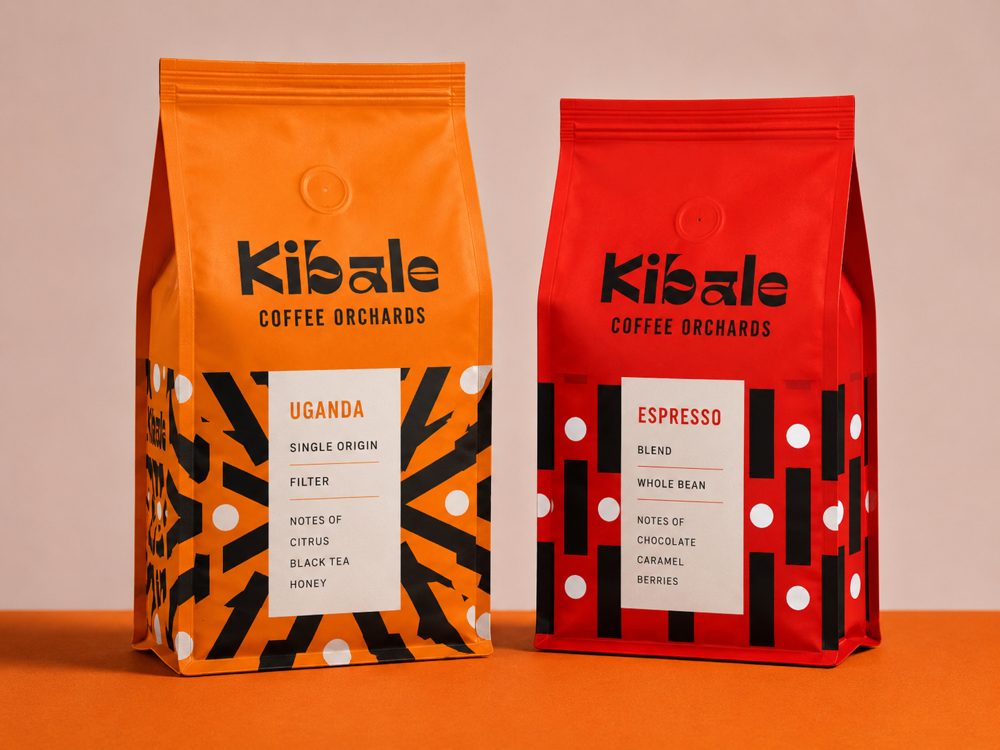
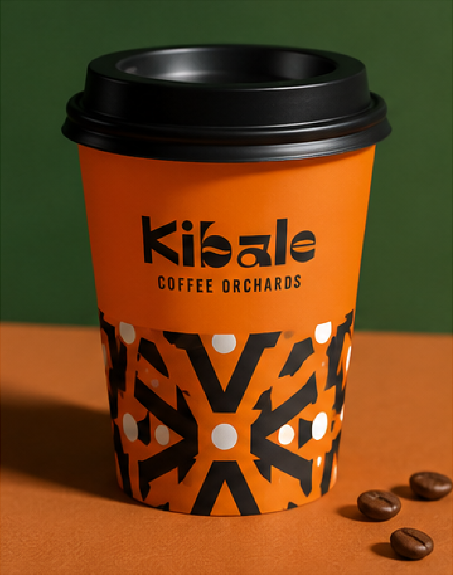
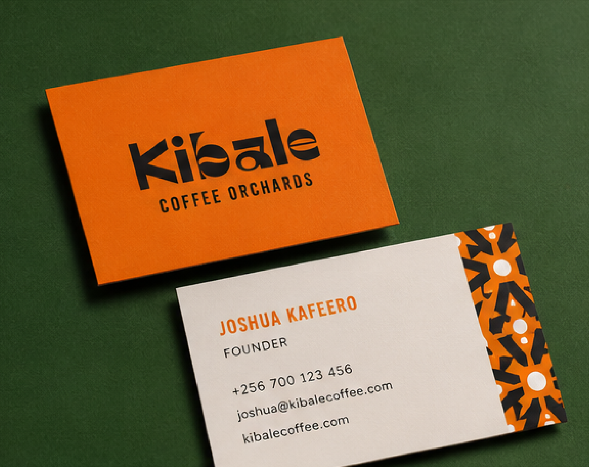
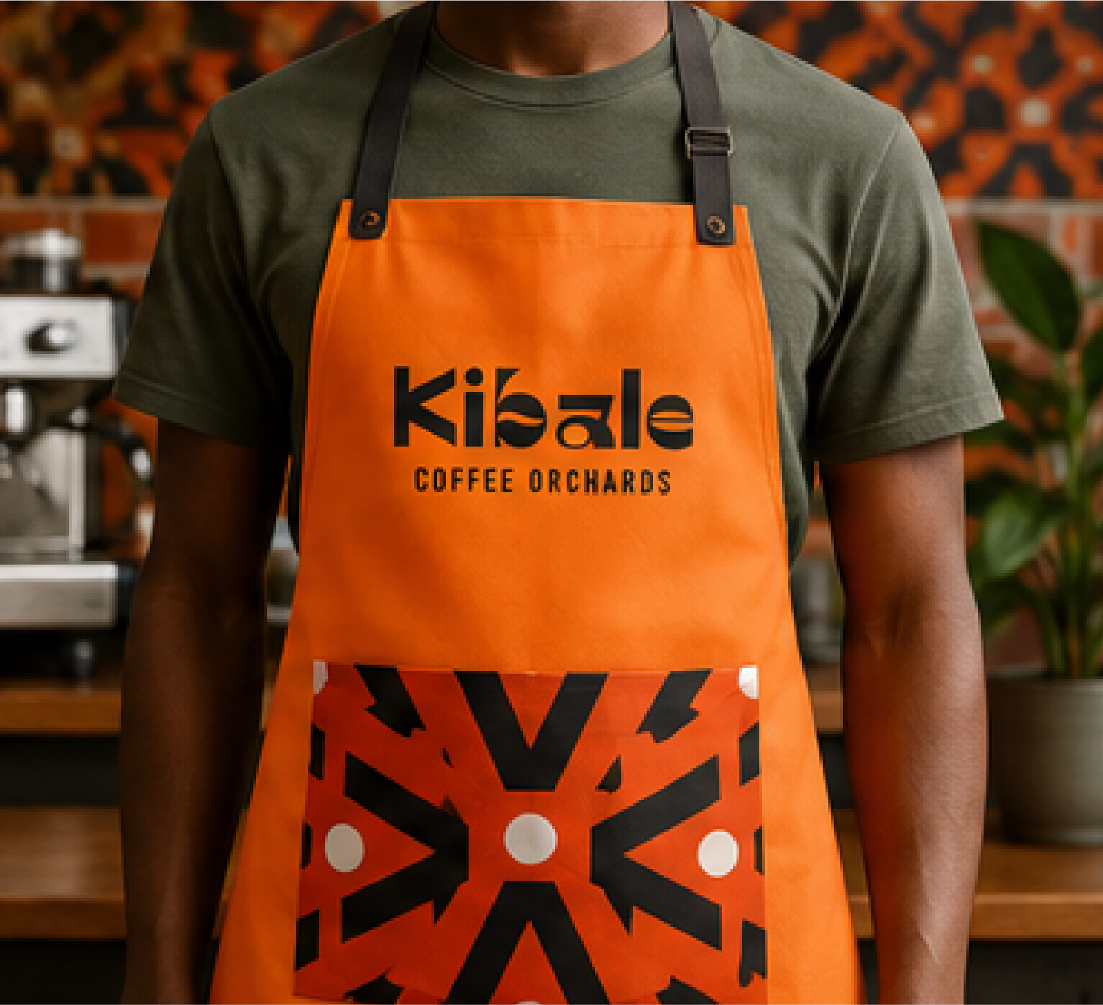
The identity uses bold colours and custom-built patterns derived from the letterforms within the logo, creating a playful and recognisable visual language across packaging and branded applications. The final direction was intentionally expressive, reflecting the warmth, energy and colour often associated with Ugandan culture.


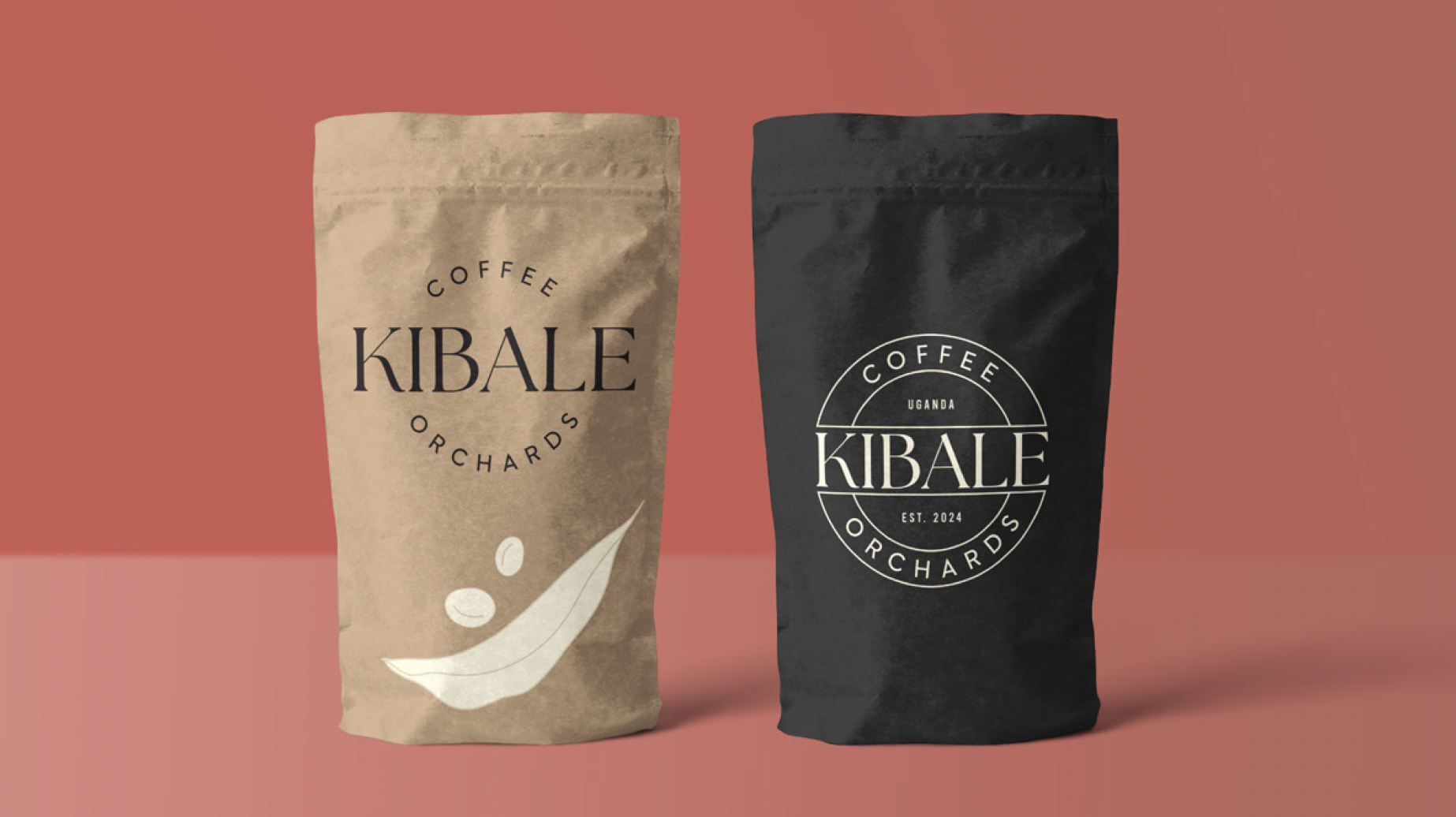
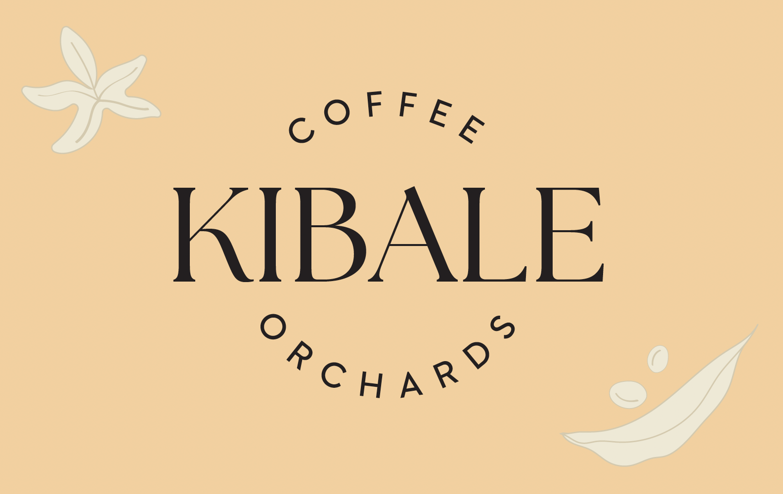
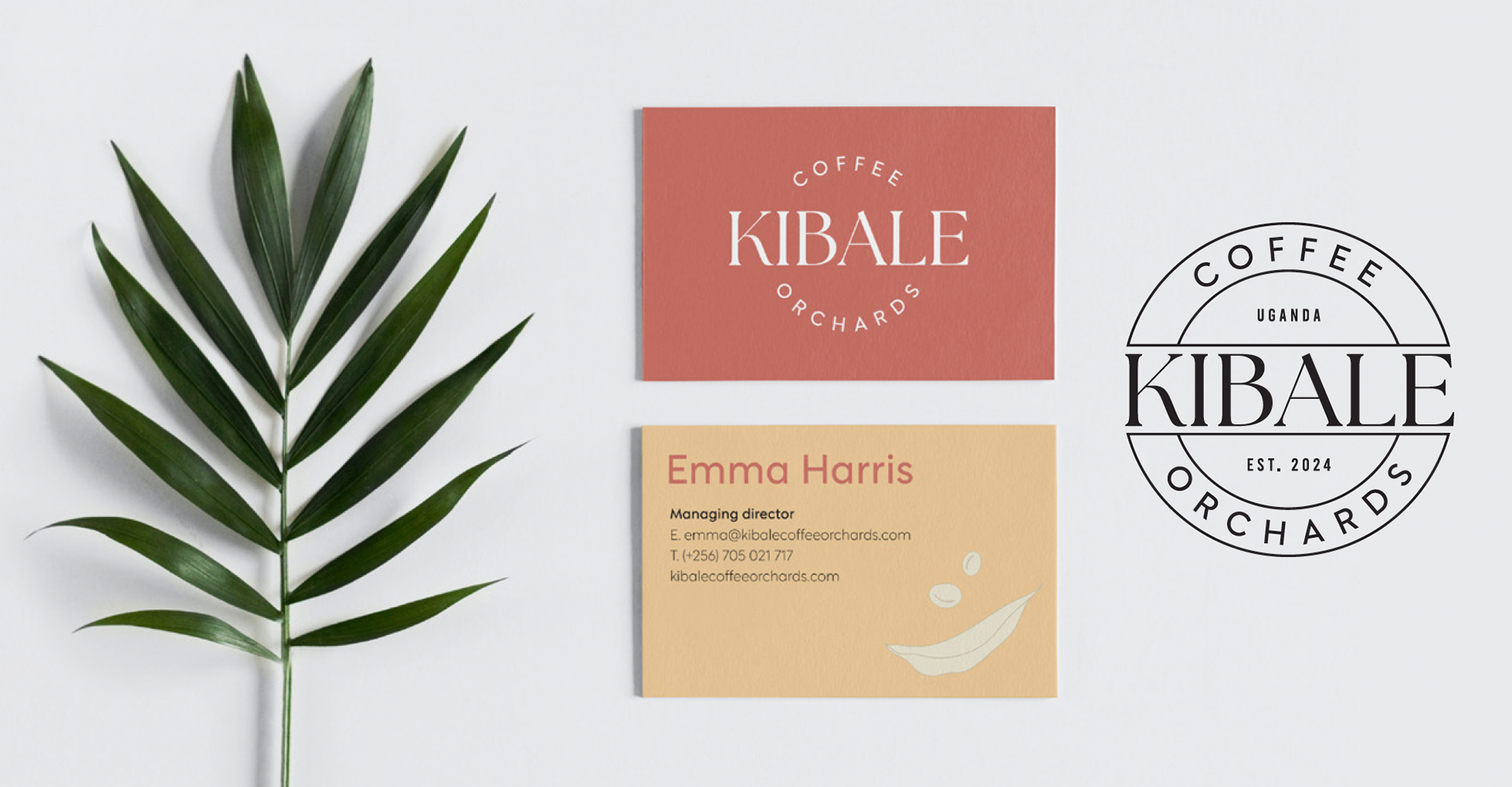
During the process, we also explored more traditional coffee aesthetics and branding approaches. Although visually polished, these concepts ultimately felt too generic and lacked the individuality and cultural depth the client was looking for.